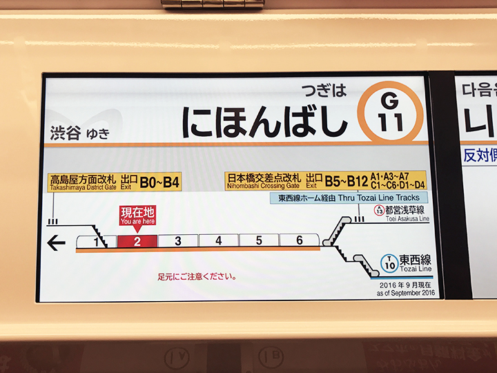
I went travelling in Tokyo back in February, and I was intrigued and inspired to see how graphics and information work in their subway system.
Even though I took on the quest to illustrate NYC's subway stations in 3D drawings, I have come to realize that because of the intricacy and complexity of the stations, a single drawing that shows one entire station often proves hard to understand. Therefore I have been looking for ways to represent the stations and directions in bite-size, easy-to understand information for subway riders.
In Tokyo, each train car has a digital display that shows the number of the car, the train's travel direction, as well as the location of escalators and elevators on the platform. Some of them also show transfer directions. My friend Ana told me that it was invented by a mom who could never get home on time because she was always lost in the stations - I find it very clever and helpful - comprehensive yet easy to understand!

