Since the 34th Street – Hudson Yards station was opened in September this year, I have updated my Times Square drawing to show 7 train running both ways!
Both arrows pointed to the right in the old version
Since the 34th Street – Hudson Yards station was opened in September this year, I have updated my Times Square drawing to show 7 train running both ways!

Both arrows pointed to the right in the old version

Coming back uptown, I tackled Lexington Avenue - 59th Street next. I mapped out the entrances in the first visit:

This is the kind of thing that kills all architects with pet peeves:
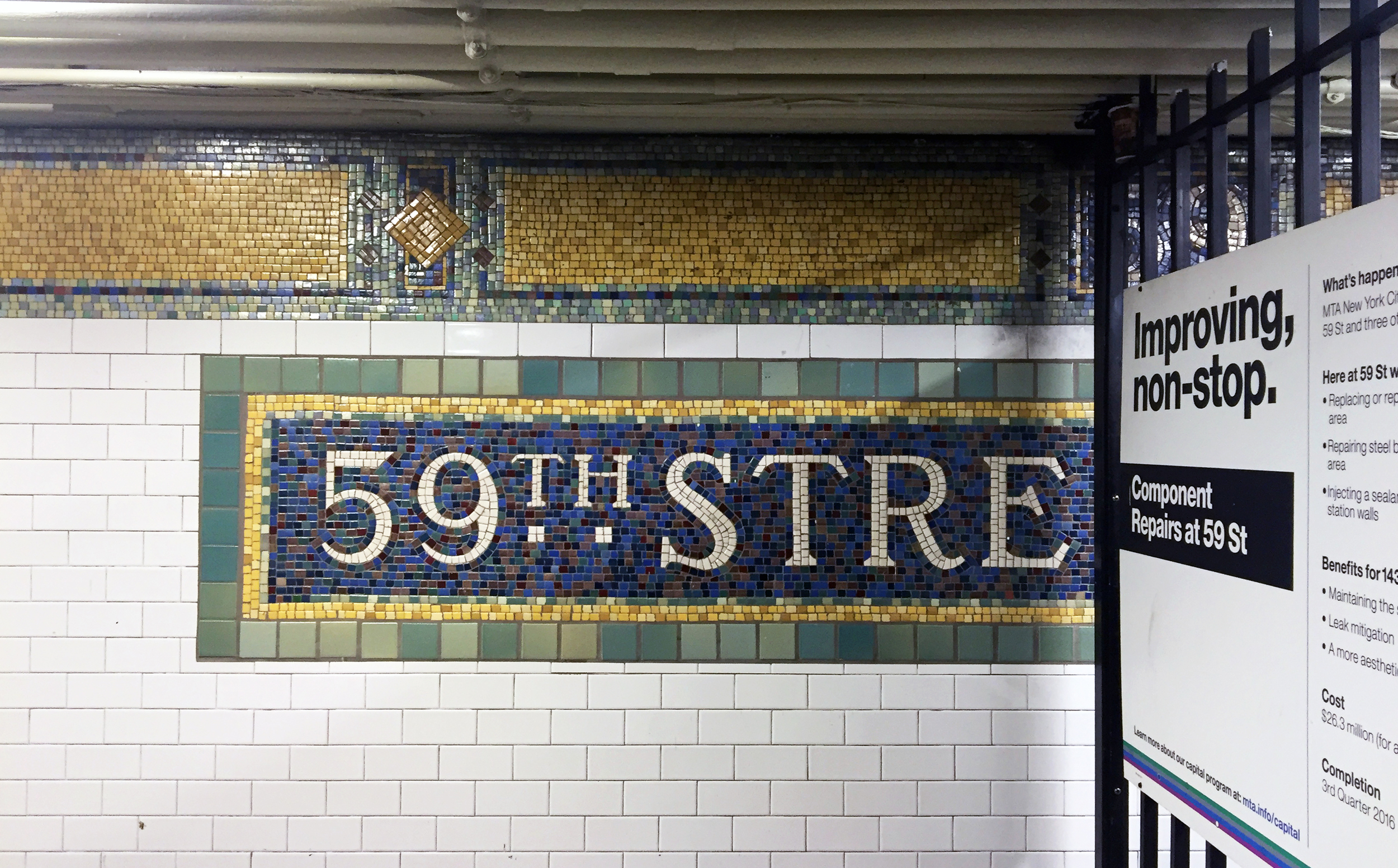
Lexington Avenue - 59th Street Snapshot
And I love this colorful Alice in Wonderland themed mezzanine!

Lexington Avenue - 59th Street Snapshot 2
Having picked up some fishballs from the supermarket and sipping bubble tea, I found myself in the Canal Street station.

Canal Street Station Sketch
See this part is so tight they have to put a railing to prevent people from walking straight into the track..
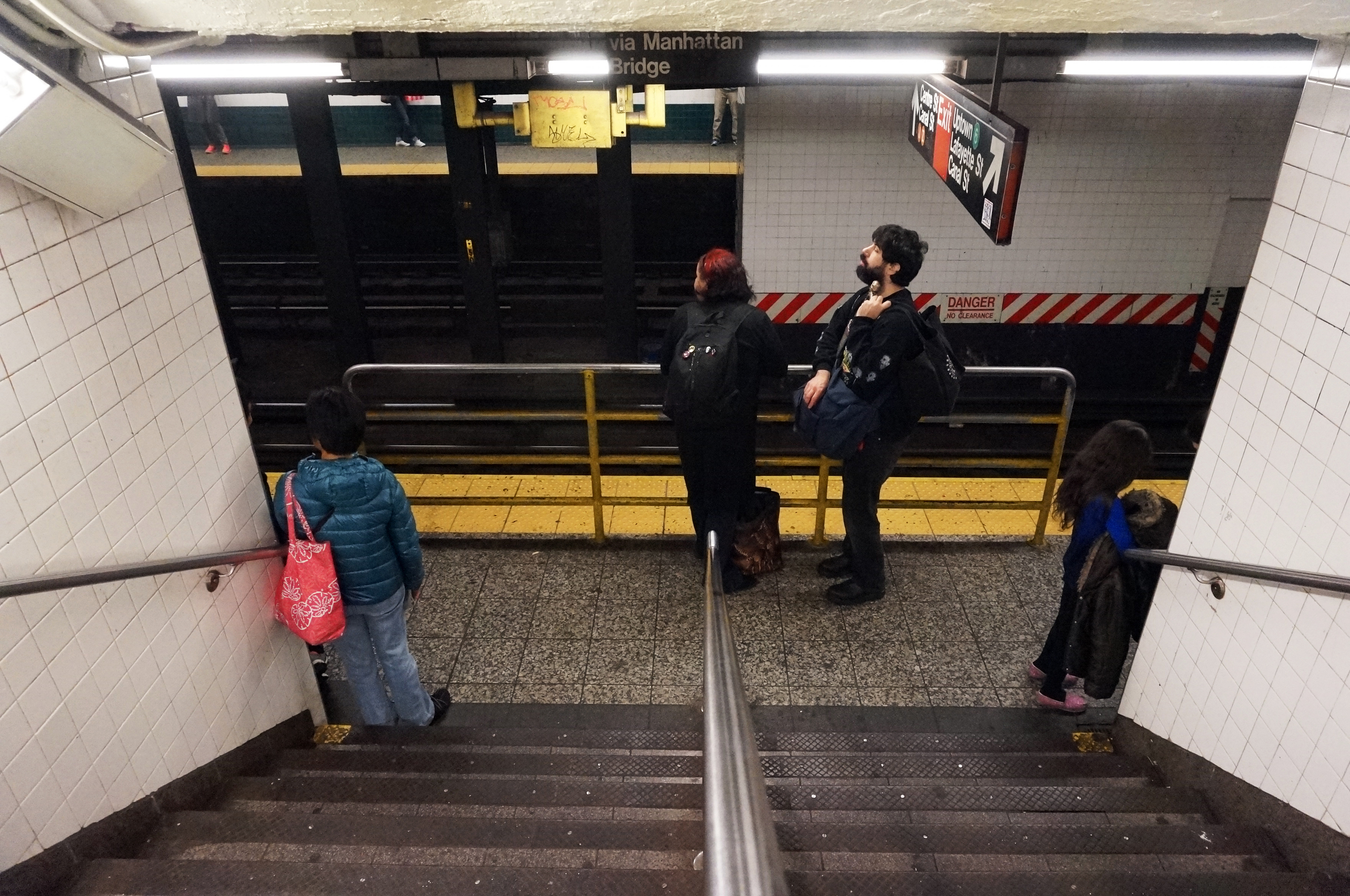
And there is this part of the station I have never been to, with this wall with funny symbols:

In an architecture office, the term "subway tile" is mostly used to describe a standard, white, rectangular tile that's 6" (wide) x 3" (high). As I take a closer look at the subway stations in the city, I realized the 4 3/8" x 4 3/8" square tile is just as, if not more common, than the 6 by 3 one. They look like this:

Here is their scale in relation to a person:
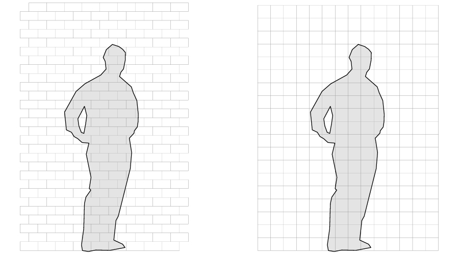
6" x 3" rectangular vs. 4 3/8" square subway tile
And in context:

6" x 3" subway tile in Columbus Circle Station
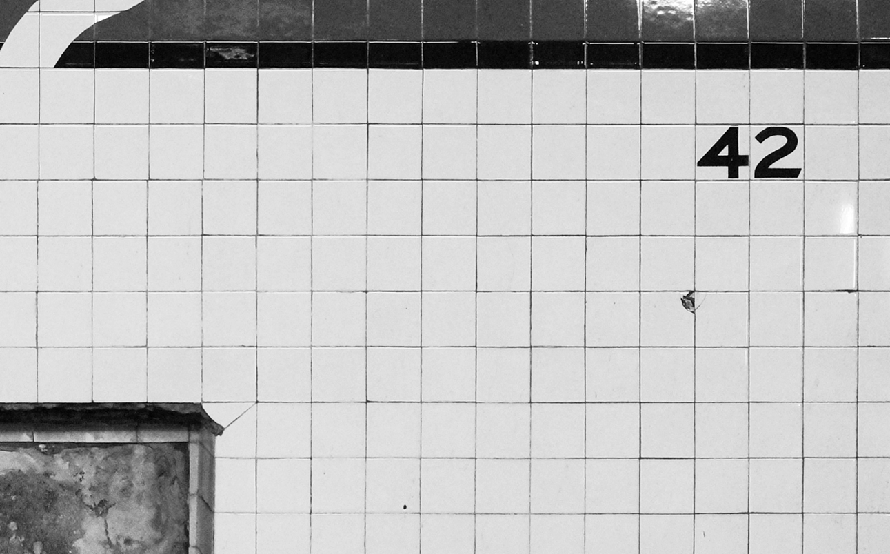
4 3/8" square subway tile in Times Square Station
This weekend I made it to the Fulton Street station. It was special to me because this is the station which inspired me to do this project in the very beginning. I no longer work in that area so it has been a while since I went down there... somehow it's even more complicated than I remember!
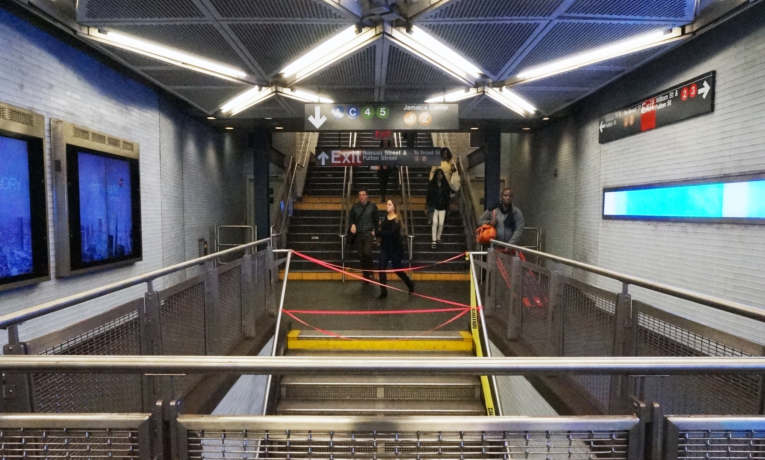
Snapshot from Mezzanine
Fulton Street Station Sketch 1
Fulton Street Station Sketch 2
And needless to say I have to go back...
As people have noticed and pointed out, I exaggerated the heights in my axonometric drawings so things don't overlap (or at least overlap less). After looking at those drawings for a while I almost forgot I have the original computer models before I stretched them. They are far from precise, but just for fun I made a rendering of the Times Square station, with (relatively) correct proportions, and with human scale:
42nd Street Times Square
Can't call it a project until there is a theme song. Recently I came across the clip of Jimmy Fallon's Lip Sync Battle with Ellen DeGeneres, and I found the PERFECT song. To quote Ellen:
“...Diana Ross has a lot of upbeat, fun dancing songs, and this is not one of them. It’s a slower song, a very meaningful song that was written in the 70s before GPS or Google Maps, … it is a song, called “Do you know where you’re going to””
I guess I will be listening to this while I go scope out the stations from now on!
Back to the drawing board, I was overwhelmed with the complex stations that I planned to draw... so I decided to pick one of the lower hanging fruits first. West 4th is a transfer station, but the station is straight, so i thought it's a good one for me to get back to drawing mode.
West 4th Street station - an "Off"
One interesting thing I noticed about West 4th, is that there is no exits on 4th street!! I don't know on top of my head, but I am almost sure West 4th is not the only station like this. After "Split", I would like to coin another term here:
noun
I have to admit, I have been designing my prints literally with "double standards". For fonts, I stuck to Helvetica because it's the MTA standard, but for colors, I tweaked them a little to make them my own:

Part of this comes from the graphic design class I took with professor Gavin Cooper, where he told us how primary colors tend to remind people of corporate logos - primary red and yellow will remind people of a certain fast food chain, and primary green, a coffee shop. And so I tried to push the colors a little off the original MTA pantones.
I don't think I am the only one who thinks like this. For example, I do enjoy the colors of these prints found on the design boom shop, by SuperWarmRed:
On a side note, not until I made this comparison graphic did I realized the letters N, Q and R in MTA standard are black because they are against a yellow background - a relatively light color. But I decided to keep the ones on my prints white, sacrificing a little bit of legibility for consistency's sake.
Thanks for all your votes and comments!
I was secretly hoping Fulton Street wouldn't win because it will be a HUGE challenge... but I will honor the poll! The next batch of five will be: Fulton, Canal, Grand Central, West 4th, and Lexington Ave-59th Street.
And if you want to see one that's not on the list, leave a comment!
Midtown is one of the busiest areas in Manhattan, especially during rush hours, with all the people, cars, and bicycles going full speed in every direction, it could be annoying and sometimes dangerous to walk around there.
The 34th Street Herald Square station is big – it spans three blocks north-south, from 32nd to 35th street, and it’s at the intersection of 6th Avenue and Broadway. Now if you want to avoid all the hustle and bustle on the streets, getting out of the exit closest to your destination is the key. It will not only make your life easier but also save you some precious time!
I personally go there a lot for Korean food (Seoul Garden is my go-to for get-togethers.. kalbi and tofu soup is the perfect combo!). And so I decided make a diagram to illustrate the most efficient way to get out of it:
How to get to Korean Town in NYC
Disclaimer: Drawing is not to scale and only shows the approximate and relative location of things
WHERE YOU ARE GOING
Korean town (a.k.a. the “Korea Way”) is the block on 32nd street between 5th and Broadway. The closest subway exit is on the NE corner of 32nd and Broadway. To get there, simply follow the red dotted line in the diagram, or follow these instructions:
Korea Way (image source)
1. First, no matter where you are, walk to the far south end of the platform.*
2. Go up the stairs, to the mezzanine. There, you will see a bunch of turnstiles, but do NOT go out of them. Instead, look for the N / Q / R sign and follow it, and go up the stairs:
Follow this red arrow
Go up these stairs
3. Then you will be on the upper mezzanine level. Now go through the turnstiles, and go to the exit on your far left. There is a sign that says “32nd Street and Broadway NE Corner”. That’s your exit!
This is the exit closest to Korean Town!
* If figuring out which way south is isn’t intuitive to you, do this: if you were on an uptown train, walk opposite to the direction the train is going, and vice versa :P
And that's it! Once you find that exit and get out of it, it's all the glorious Korean food waiting for you. Yum!
New York City is a beautiful and exciting city, especially when you have time and it’s nice outside, it’s delightful just to walk around and look around. But then there are also bad days, when you are in a hurry and it’s cold and rainy… on those days, if you had to take the subway, you would either want to be underground for as long as you can, or to have the most efficient way around the station, right?
There are signages in the subway stations, but they don’t give you an overall picture of what the stations look like. In light of that, I have taken the initiative to illustrate some of the more complex stations, as well as the landmarks and popular destination points around them. Let’s look at the 59th Street Columbus Circle station:
59th Street Columbus Circle Station layout map
Disclaimer: Drawing is not to scale and only shows the approximate and relative location of things
The 1 train runs on the upper level, along the diagonal Broadway, and the A / C and B / D trains run on the lower level, straight along 8th Ave / Central Park West. On both levels, the east tracks go uptown and the west tracks go downtown.
Read more at http://www.turn-style.com/
To transfer between uptown and downtown trains, the shortest path is the walkway between the tracks on the lower level. I marked it with a red dotted line in the graphic. It has a wavy guardrail and it looks like this:
So this is the first of a series of blog posts I plan to do for the five stations I have picked. More to come!
Ever notice the first and last step of each flight of stair are painted yellow? It's actually a very specific color called "safety yellow". I guess it makes it more apparent that it is the last step?
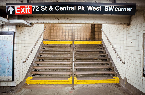
image source: https://www.flickr.com/photos/derekskey/8435848988
While working on my graphics for this project, I have to pick everything that goes into it- line type, line weight, paper size, paper texture, transparency etc.
The choice of font is a no-brainer, since I will just use what the subway system uses in all of their signages- HELVETICA. In fact, there is a whole documentary about this typeface:
A glimpse at the wonderful documentary (2007) by Gary Hustwit: http://www.helveticafilm.com/about.html Own the film for $10: http://itunes.apple.com/us/movie/helvetica/id284740710
There is also a book about it:
After tackling complex stations like Times Square and Herald Square, the 23rd Street station becomes relatively easy to survey and draw because it only has one line and therefore one level underground. Instead of going back and forth, I sketched out the whole station after one visit and it looks like this:
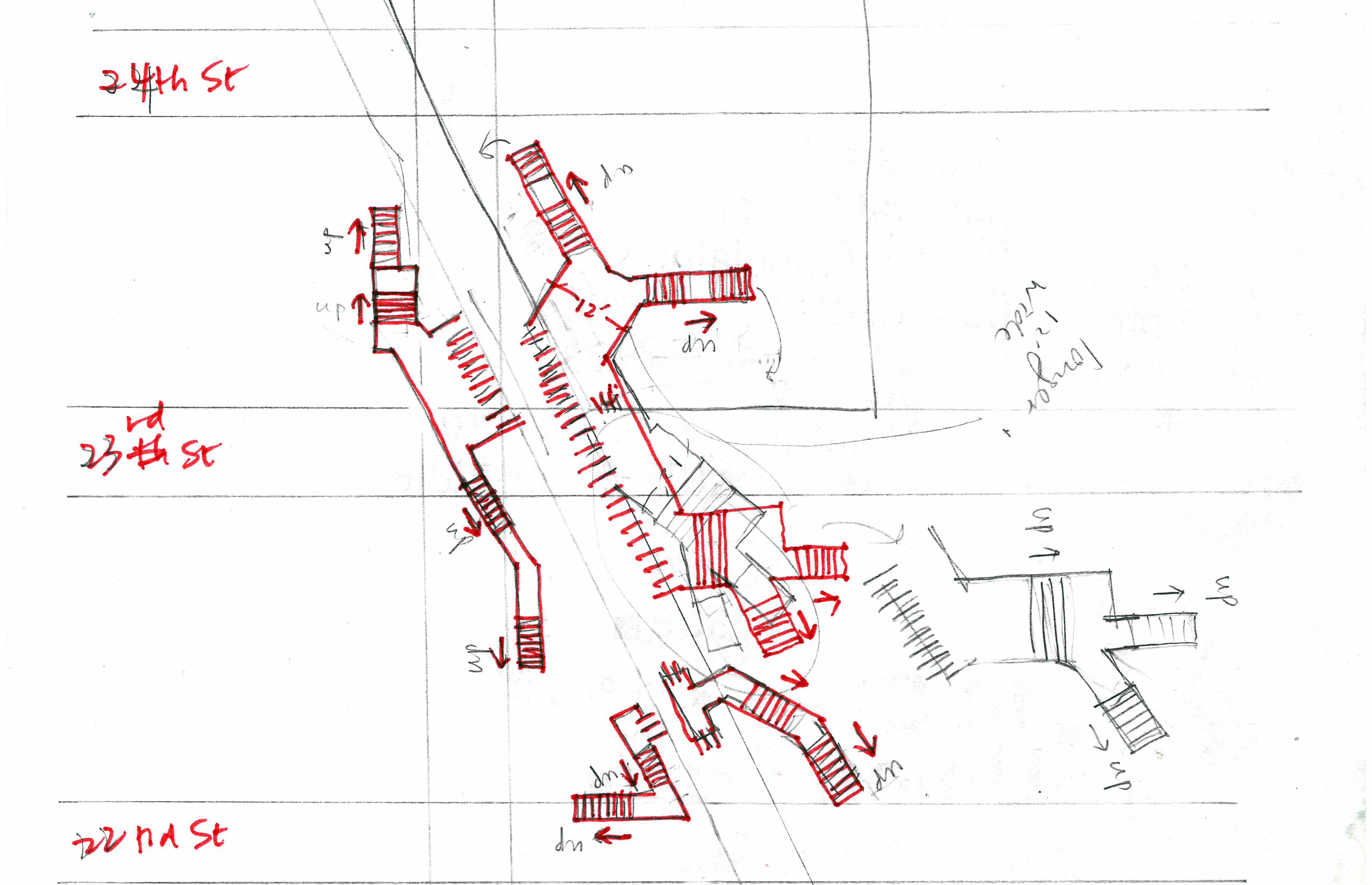
What is worth mentioning is that it is one of those stations that does NOT let you transfer between uptown and downtown trains inside the station. If you realized you need to reverse your direction of travel, you either have to leave the station, go across the street and swipe (and pay if you don't have a pass) again, or, you have to take the train to a station that does let you transfer and go back.
Of course, it does say so on the sign, that it's for "Uptown and Queens" only. But I think there should be a symbol for, and a term that describes, such stations. I would like to coin the term "SPLIT" here:
noun
is how wide a subway car is.

When I started this project, I naively thought I could just go walk around in the stations, take some pictures, and sketch the stations out casually like this:
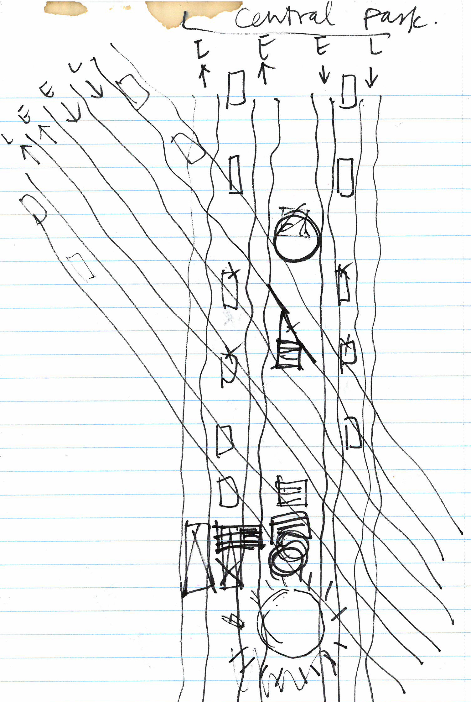
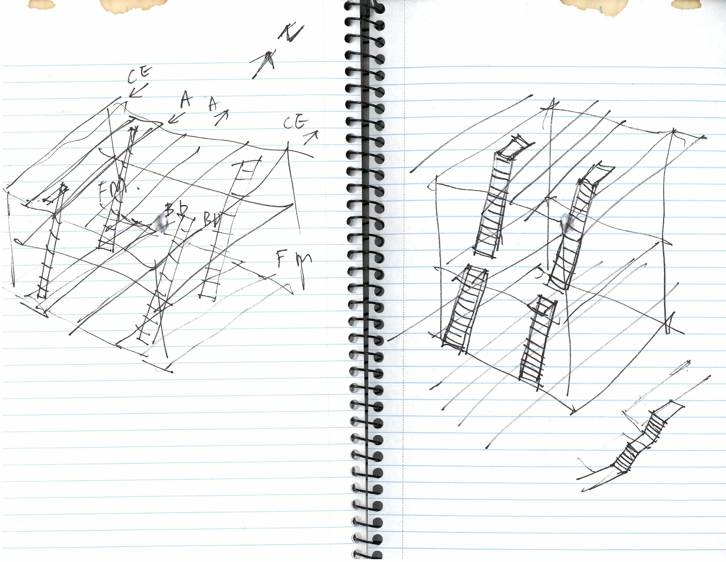
But in reality, it was way harder than I thought. In order to work out where things are relative to each other, I had to developed a process to visualize the stations step by step. First, I document the entrances (from streets to turnstiles) on the neighborhood maps:

Then I make 2D drawings in the computer:

And then I go back and sketch some more, verifying my guesses and adding things I missed:

Then I model it in 3D:

And I render it:

And all of these steps kinda go back and forth and back and forth until I get the overall picture. The final graphic will be a combination of all of these. Almost there!
More sketching


And while I was at it, I saw some of the murals that I haven't had a chance to notice before-


